Behind The Scenes of a Major Website Redesign and Rebrand at Monterey Premier
Over the years Monterey Premier has grown to include multiple types of services & products, a multi-vendor marketplace with over 240+ Divi add-ons sold by developers and designers from all over the world, and a multi-author blog with over 30+ contributors.
In that process, we learned a lot about our visitors that we did not know in the early days. So a lot of strategy and planning had to go into our 2018 website redesign and rebrand. In this article, I am going to spill all the beans.
Monterey Premier’s Growing Pains
As we grew, we simply made room in the existing website for these new areas. Pretty soon our menus and pages were starting to get a little confusing for our visitors. People looking for website design and development services were confused by the marketplace and the emphasis on the Divi theme by Elegant Themes.
And people looking for the Marketplace were a little confused when they stumbled across a website that looks more like website design business. And worst of all, our messaging did not even attempt to clear things up. It was all about what we thought of ourselves rather than what we “actually” do and how we “actually” can help.
When contemplating the new website design, I had the following goals in mind.
Keep The Website Design Simple
When you are the kind of guy or gal that enjoys making Divi tutorials about new website designs and animations, then you know this is not easy to do. I was up for the challenge but I will admit I added and removed so many sections, graphics and modules on each page that if I kept everything, each page would be much longer than they are now.
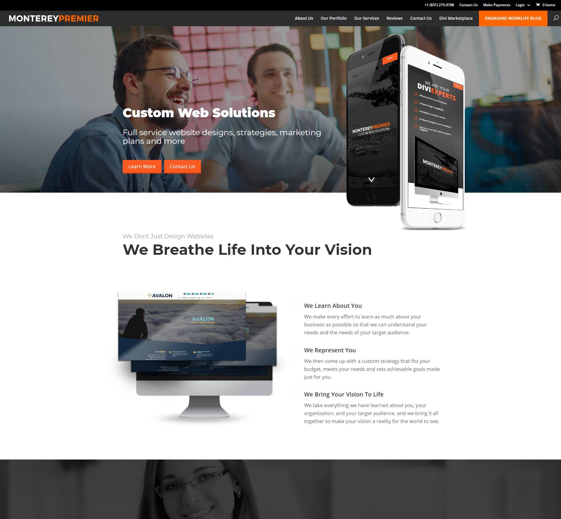
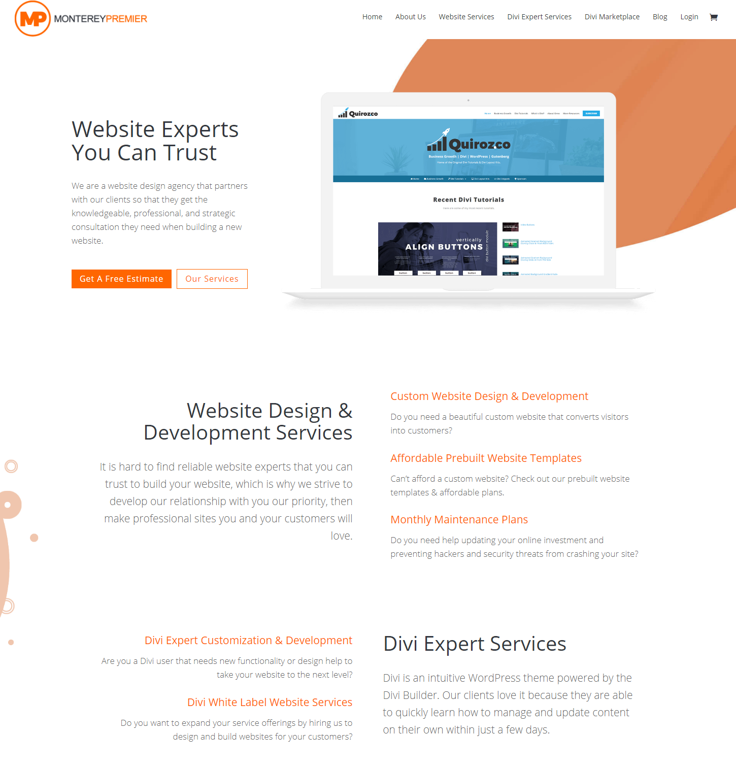
So with the new design, you will see a simplified & consolidated menu, a lot more white space, very subtle animations, graphics and backgrounds. I also decided to keep the color pallette to a minimum. All these minor design elements help keep the focus on the content which I will discuss next.
Homepage Content That Actually Helps The Visitor
Putting The Customer First By Clarifying What We Can Do For Them
The next objective was to clarify what we do, answer the client’s pain points, and make our messaging easier to digest. To do this, we started off by changing the priority messaging (first few sections of the home page) from “about who we are”, to “about what they need”. Notice how we replaced all the “we” from our original content and focused more on the customer.
What we were trying to do here was to clarify that our primary business is building websites. So if you are a business owner looking for a new site, you know you came to the right place.
A majority of our business comes from people who are already using the Divi theme, so we needed to speak to them as well. We needed to do so in a way that would not distract other visitors, so our messaging required us to describe what Divi was without alienating them with jargon. By doing so, we are getting our regular website design customers familiar with the theme before we even have our first conversation.
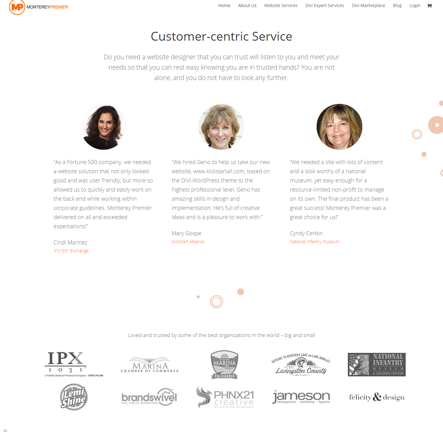
Backing Up These Claims With Strategic Testimonials And Images
Part of my message is now focusing more on client needs rather than who we are so I was strategic in choosing the testimonials that go on the homepage. They could not be just another positive review; they had to back-up the claim that we meet the needs of the client.
I did not want to over clutter my homepage with testimonials. So I opted to select three testimonials and a handful of client logos to show the diversity of our clients from size, location, and industry.
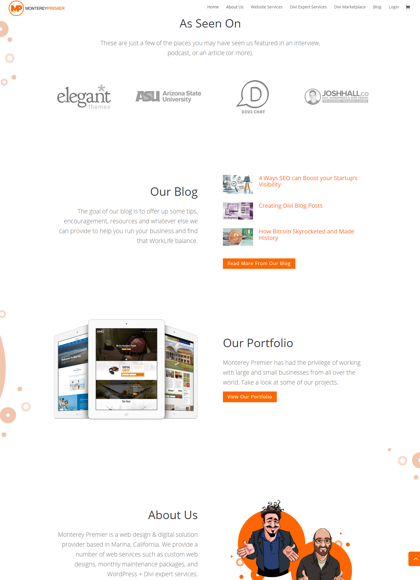
Moving The Authority Sections To The End Of The Homepage
In keeping up with putting the client first in this new design, I moved my authority sections to the end of the homepage instead of towards the top. This information is useful to have on the front page, but I do not necessarily think it needs to be on the top.
Better Brand Consistency Throughout the Website
When I first added the Marketplace and the Blog, I wanted to give each piece a little bit of its own identity. But I have learned over time that branding consistency is essential. The key is to be consistent without being boring.
Throughout the main inner pages, you will now see a consistent header and page structure on most of the pages. We still have some work to do on this.
Explain what The Divi Marketplace Is And Who It Is For
I still needed to figure out a way to make sure the Marketplace got a little more prominence and attention than previous renditions of the website.
Initially, I just wanted to sell my own Divi products on my website, but at the request of several others who were just getting started in the Divi community, I agreed to open it up to other vendors to help promote growth and community, but it never received the attention to detail that a proper marketplace should have.
The Homepage Call To Action
So for the homepage, it gets a little more love by being the only section with a dark background making it a more effective call to action.
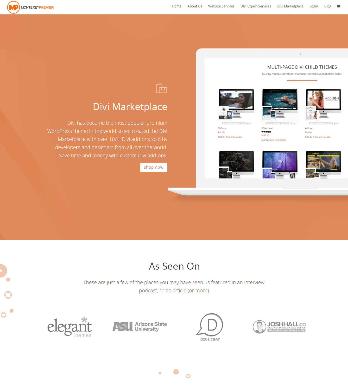
A New Marketplace Homepage
In the past, the Marketplace link led right to the products page, and so many of our visitors who were not familiar with Divi or Divi Child Themes were not sure what to make of it. Some thought this was the service we provided, and some thought these were our products, while others left our website confused by the whole thing.
Now do not get me wrong, that is not to say it was hurting traffic. The Marketplace page is the second most visited page on our entire website (after the homepage). But I still needed to get the message across as to what the Marketplace was, who it was for, and where Monterey Premier’s place was in all of this.
So we replaced the old Marketplace homepage with a new homepage that explains what all of this is, who it is for, and most importantly who it is not for.
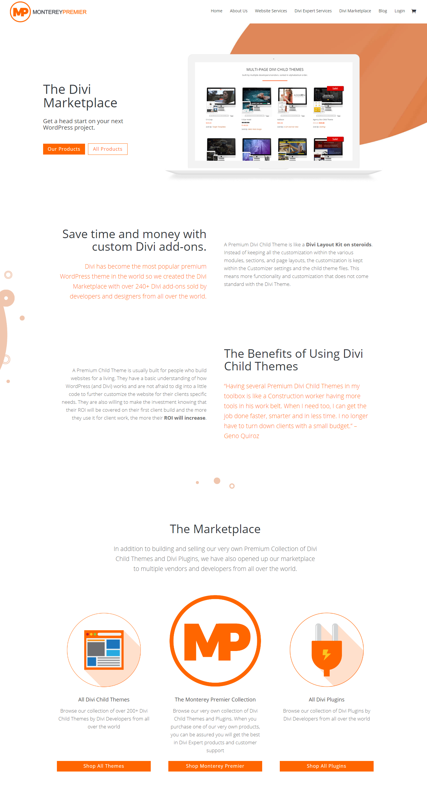
We also added more sorting options, and removed the busy sidebar from the product galleries to help keep the focus on the products. The sidebar still has it’s merits so we kept it on the product pages.
Refine The Purpose Of Our Blog And Simplify the Interface
An excellent source of incoming traffic comes to us through our blog. Our goal is to provide engaging advice & inspiration for anyone looking to find purpose, be inspired, and improve their worklife balance. We did not want to restrict it to website advice or tutorials because our visitors are looking for more than that.
Although we still want to build authority in the world of website design and development, the ultimate goal of our blog is to attract an audience that goes beyond that world. So by having all these resources available to our clients and potential clients, it becomes a business owners knowledge base for more than our services and products.
Moving forward, we intend to put more effort into posting articles that are related to helping website owners do more with their new websites and learn how to get a better return on their investment over time.
We also removed the busy sidebar on the main page and simplified it on the subpages so that the reader would have a better reading experience. I know that the sidebar is valuable marketing and advertising real estate, but in the end, I felt the experience is far more important than the potential advertising and marketing space (for now).
These Seven Simple Goals Have Already Had a Huge Impact
So with these seven goals in mind we have finally completed most of the redesign. How is it working so far?
Well since launching the redesign earlier this month, the amount of inbound leads for Website Design Services, Divi Expert Services, and Divi White Label services have almost tripled and that is exactly what we wanted. I would say simplifying the design and clarifying the message has made a huge impact on our inbound leads already coming to our website through organic searches and referrals.
So now that I shared all my strategies, what website design tips and strategies are you using or planning to implement in 2018?
Geno is the Owner/Creative Director at Monterey Premier, a web design agency that specializes in Divi and is based out of Monterey, Ca. He is a Divi expert and is known for his Divi tutorials & tips on Quiroz.co and is an excellent source of knowledge for anything related to Divi. Geno is also a Canva expert and helps other Canva users with his tutorials and tips here on the Monterey Premier blog. He has been designing websites since 1996 and enjoys all things design, traveling, hanging out with friends, encouraging other believers, and experimenting with new technologies.